

"Read easily" profile
A dyslexia-friendly website, in one click
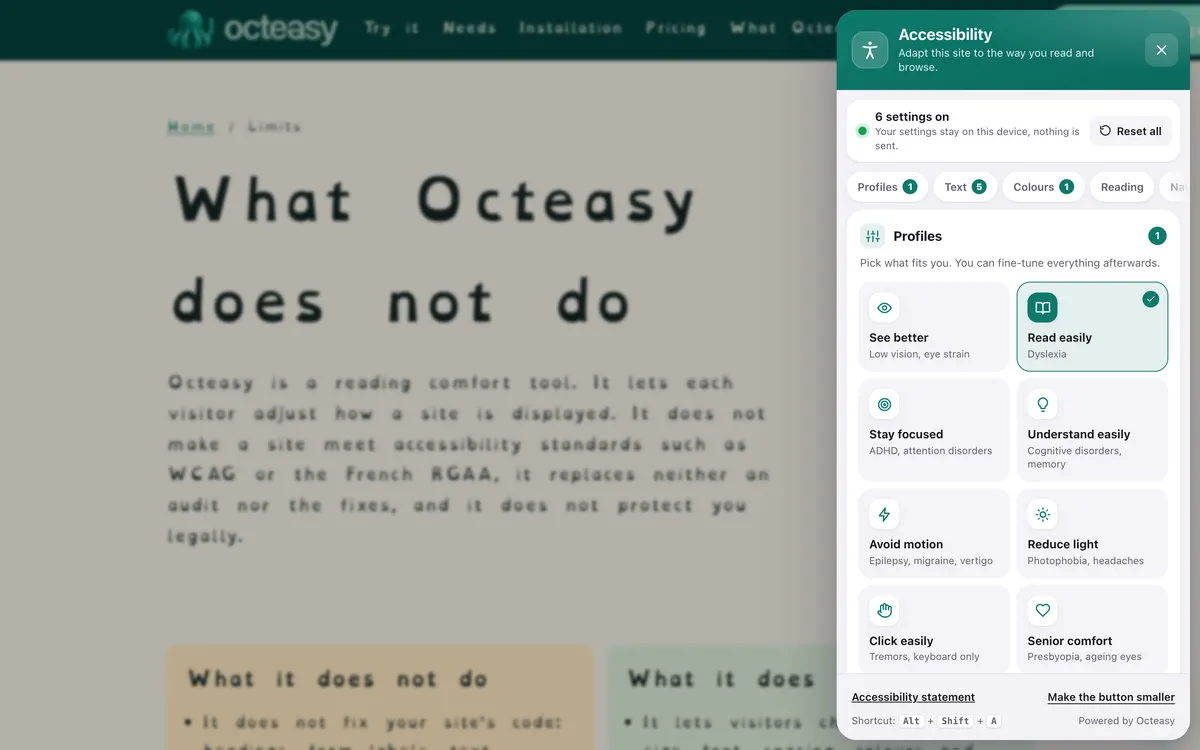
Octeasy's "Read easily" profile applies, in one click, a font designed for dyslexia, double line spacing, wider gaps between letters and words, left-aligned text and a cream background. Visitors stay in control of every setting.
In the panel, choose "Read easily". Shortcut: Alt + Shift + A.
- Free for visitors
- No cookies
- Settings stay on the device
- Panel in English and French


- OpenDyslexic
- Line height 2
- Letters +0.05 em
- Words +0.12 em
- Left-aligned
- Cream background
Who benefits from the "Read easily" profile?
The profile is designed for dyslexia, which a French study estimated at between 3.5% and 6.6% of pupils starting secondary school, depending on the criteria used. It also helps anyone, with no condition at all, who finds cramped or justified text hard work.
With a condition
- DyslexiaDecoding words takes more effort: even spacing and left-aligned text lighten the page.
- Related learning difficultiesDysgraphia, dyspraxia: reading is often slower too, and benefits from more space.
- Attention difficultiesOften found alongside dyslexia: the reading ruler helps readers keep their place.
In everyday life, no condition at all
- "I keep losing my place"On a long, dense text, double line spacing and the reading ruler help you keep track.
- "I'm reading in another language"Words that stand apart and read aloud make a less familiar language easier to follow.
- "Walls of text put me off"More space between lines makes a long article or terms and conditions less daunting.
- "I read in the evening, tired"A cream background and airy lines are gentler on the eyes at the end of the day.
What gets in the way, and what the profile changes
Cramped lines, crowded letters, justified text and glaring white are among the obstacles the British Dyslexia Association's style guide warns about. The "Read easily" profile fixes all six at once, across the whole page, without reloading it.
What gets in the way : Tight lines make readers skip a line
What the profile does : Wider line spacing 2
Twice the text height. Also 1.75 or 2.4.
What gets in the way : Crowded letters get in each other's way
What the profile does : Letter spacing +0.05 em
A slight gap, up to +0.16 em.
What gets in the way : Words run into each other
What the profile does : Word spacing +0.12 em
Up to +0.4 em, set together with letters.
What gets in the way : Justified text opens white channels
What the profile does : Left alignment no justification
Even gaps between words.
What gets in the way : Bright white glares
What the profile does : Cream background warm tint
Or yellow, blue, green, pink.
What gets in the way : The site's font is tiring
What the profile does : Dyslexia font OpenDyslexic
Only downloaded if chosen. Atkinson Hyperlegible is also available.
Also in the panel
- Reading ruler A band follows the mouse, a finger or the keyboard and highlights the current line.
- Reading mask It darkens the page except for a clear band around the pointer.
- Read aloud A paragraph on click, or the whole page, using the device's own voices: nothing is sent.
- Text size From 100% to 200%, and lines capped at 68 characters.
See the exact values: Octeasy's values compared with the BDA and WCAG benchmarks
| Setting | Profile | Other choices | BDA benchmark | What the page must support (WCAG) |
|---|---|---|---|---|
| Line spacing | 2 | 1.75 or 2.4 | 1.5 | 1.5 (criterion 1.4.12) |
| Letter spacing | +0.05 em | +0.1 or +0.16 em | about 35% of the average letter width | 0.12 em (criterion 1.4.12) |
| Word spacing | +0.12 em | +0.25 or +0.4 em | at least 3.5 times the letter spacing | 0.16 em (criterion 1.4.12) |
| Alignment | left | single option | left-aligned, not justified | no justification (criterion 1.4.8, AAA) |
| Line length | the site's own | 68 characters | 60 to 70 characters | 80 characters at most (criterion 1.4.8, AAA) |
| Background | cream | yellow, blue, green, pink | plain cream or pastel rather than white | colours chosen by the reader (criterion 1.4.8, AAA) |
WCAG criterion 1.4.12 does not set values to apply: it requires the page to stay readable when visitors push spacing up to those values. BDA benchmarks: style guide, version archived in July 2025.
Before and after: the same text
First a paragraph as you often see it, then the same one with the exact settings of the profile. To try it on a real page, open the widget.
Holiday club
Registration for the February half-term opens in early January. Incomplete forms cannot be processed, so please attach proof of insurance and your child's vaccination record.
See pricesRegister
Turn on "Read easily" in three steps
On any site with Octeasy, with a mouse, a finger or the keyboard. The settings are then saved in the browser, for that site.
Open the panel
The round button at the bottom of the screen, or Alt + Shift + A.
Choose "Read easily"
Font, spacing and background change straight away across the page.
Fine-tune
Keep what helps, change the rest: font, line spacing, background, ruler or voice.
Do dyslexia fonts work? What the research says
Studies have not shown that a "dyslexia font" makes people read faster or more accurately, on average. Letter and word spacing, on the other hand, has a measured effect. Octeasy therefore offers the font without imposing it, and relies first on spacing.
OpenDyslexic: no measured gain
No extra speed or accuracy compared with Arial and Times New Roman for 12 pupils with dyslexia; neither better nor worse in an eye-tracking study of 48 readers.
Wery and Diliberto, 2017; Rello and Baeza-Yates, 2013Nor did the "Dyslexie" font
No effect for 170 children with dyslexia. Its slight advantage vanishes once Arial gets the same spacing.
Kuster et al., 2018; Marinus et al., 2016Spacing helps, letters and words together
Wider letter spacing roughly halved reading errors for 74 children with dyslexia. Spacing letters without spacing words slows reading down.
Zorzi et al., 2012; Galliussi et al., 2020Coloured backgrounds: comfort
A systematic review found no grounds to recommend coloured overlays for reading difficulties.
Griffiths et al., 2016
The takeaway: spacing and layout matter more than letter shapes, and everyone has their own preferences. Hence settings that can be combined, never imposed.
Making your site dyslexia friendly: what is left to do
A widget helps the visitor who opens it; a site that is readable by default helps everyone. These points, from the BDA style guide and WCAG, are handled in your content and stylesheet.
Writing
- Short sentences, one idea per sentence.
- Lists rather than long paragraphs.
- Headings that say what the section contains.
Layout
- Left-aligned text, never justified.
- Lines of 60 to 70 characters, line spacing of at least 1.5.
- Bold for emphasis, not italics or capitals.
Code
- A sans serif font at 16 to 19 pixels.
- A page that copes with increased text spacing (WCAG 1.4.12).
- Zoom to 200% without losing content (WCAG 1.4.4).
Your questions about dyslexia
What font is best for dyslexia?
No single font suits everyone. The British Dyslexia Association recommends a plain sans serif font such as Arial, Verdana or Comic Sans, at 12 to 14 points. "Dyslexia fonts" have not shown an average benefit. Octeasy leaves the choice to the reader: OpenDyslexic, Atkinson Hyperlegible or the site's own font.
Is OpenDyslexic effective?
Not on average: it improved neither reading speed nor accuracy for pupils with dyslexia (Wery and Diliberto, 2017), and an eye-tracking study found it neither better nor worse (Rello and Baeza-Yates, 2013). Some readers still find it more comfortable, which is why it remains an option.
What colour background is best for dyslexia?
The British Dyslexia Association suggests a plain cream or soft pastel background rather than bright white, with dark text. The best choice varies from person to person, and coloured overlays have no proven effect on reading. Octeasy offers cream, yellow, blue, green and pink.
What font size is best for dyslexia?
The British Dyslexia Association recommends 12 to 14 points, roughly 16 to 19 pixels on screen; some readers need more. With Octeasy, visitors can enlarge text from 100% to 200% on every page of the site.
How do you make a website dyslexia friendly?
On the site: left-aligned text, line spacing of at least 1.5, lines of 60 to 70 characters, a sans serif font, short sentences, and a page that copes with increased text spacing (WCAG 1.4.12). Then a tool such as Octeasy, so each visitor can adjust the display to suit them.
Is Comic Sans good for dyslexia?
The BDA style guide lists Comic Sans among suitable sans serif fonts, alongside Arial and Verdana. A plain letter shape, a comfortable size and generous spacing matter most, and preferences differ: let each reader choose.
Are dyslexia fonts required for accessibility?
No. Neither WCAG nor the French standard (RGAA) requires a particular font; among other things, they require the page to stay readable when spacing is increased (criterion 1.4.12). Octeasy does not make a site meet these standards and does not replace an audit.
Is the widget free for visitors?
Yes. Visitors pay nothing and install nothing: every comfort feature is included in every plan, even the free one. No cookies; settings stay in their browser.
Sources (11)
- British Dyslexia Association, Dyslexia Style Guide (version archived in July 2025)
- W3C, WCAG 2.2, Understanding 1.4.12 Text Spacing and 1.4.8 Visual Presentation
- UK Home Office, Designing for users with dyslexia (accessibility poster)
- Di Folco et al., "Epidemiology of reading disability: a comparison of DSM-5 and ICD-11 criteria", Scientific Studies of Reading, 2021
- Wery and Diliberto, "The effect of a specialized dyslexia font, OpenDyslexic, on reading rate and accuracy", Annals of Dyslexia, 2017
- Rello and Baeza-Yates, "Good fonts for dyslexia", ASSETS 2013
- Kuster et al., "Dyslexie font does not benefit reading in children with or without dyslexia", Annals of Dyslexia, 2018
- Marinus et al., "A special font for people with dyslexia: does it work and, if so, why?", Dyslexia, 2016
- Zorzi et al., "Extra-large letter spacing improves reading in dyslexia", PNAS, 2012
- Galliussi et al., "Inter-letter spacing, inter-word spacing, and font with dyslexia-friendly features", Annals of Dyslexia, 2020
- Griffiths et al., "The effect of coloured overlays and lenses on reading: a systematic review", Ophthalmic and Physiological Optics, 2016
Content reviewed on .
Try "Read easily" here, then add it to your site
Visitors get every comfort feature, even on the free plan. A single line of script is all it takes.